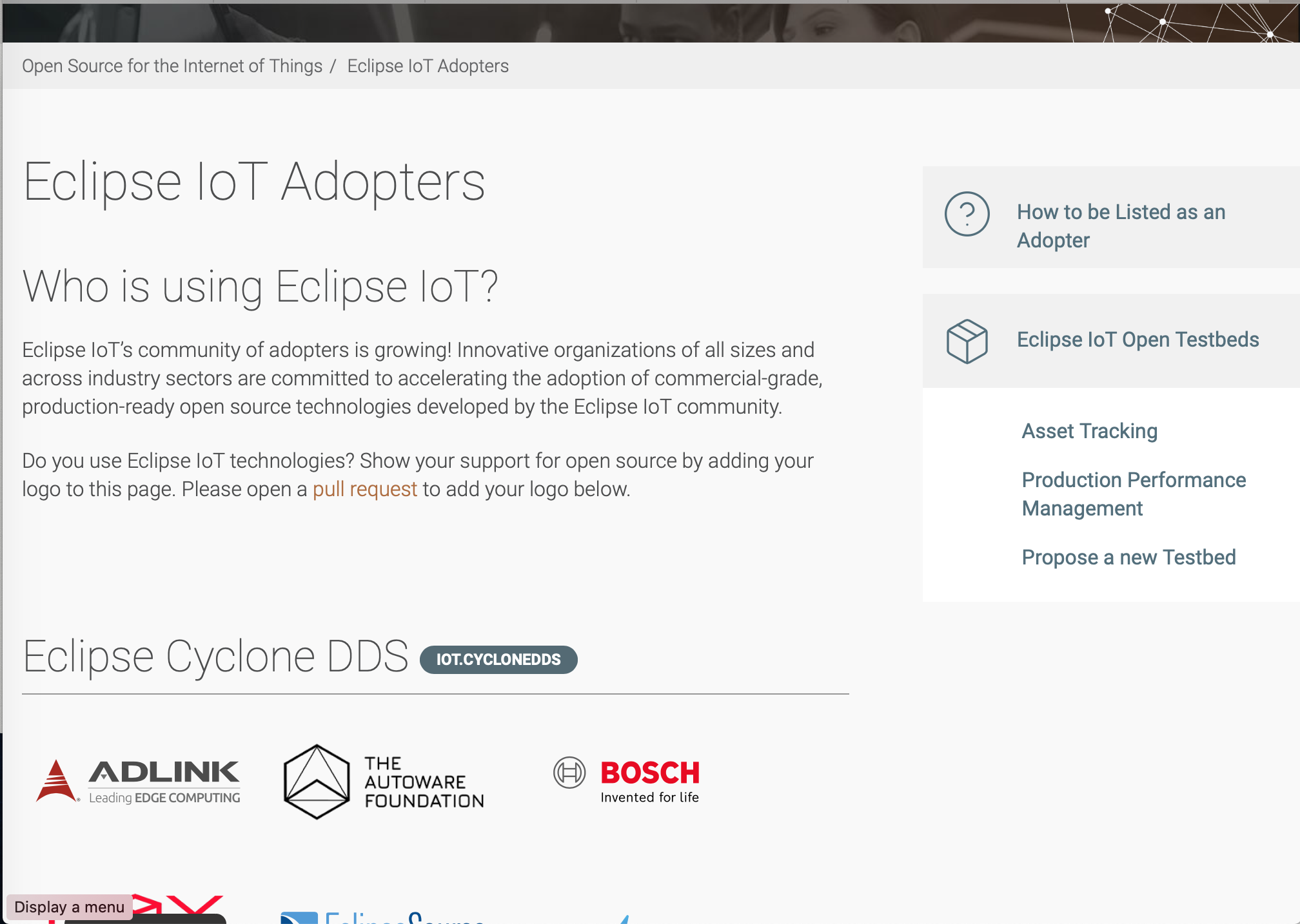
issues & suggestions re today's adopter page redsign
Created by: joespeed
bold the clickable link, especially since you have a low contrast color palette (which isn't great anyway from an accessibility perspective). Shouldn't it just say "click here" because pull request is no longer the most popular nor easiest way for people to add their logos? Instead they are using "create issue"

You just added a bunch of stuff to the right side of the page. Which is shoving all the content over to the left margin. Also maybe the testbed section on the right shouldn't appear on every single page?
could you maybe move the title up into the large image header? Have to scroll down pretty far before seeing any content.

